Finding a perfect place for online printing services can be tough. You design, you edit and you design again. You upload, and submit it. And then you pray… you pray your design will look beautiful printed. Just as you had imagined. To me, getting my final piece in the mail is like a mini designer Christmas. It’s so exciting when you open the box and look at your design… alive and in color!

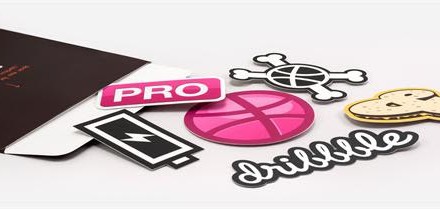
With PrintRunner.com you don’t have to worry about worrying you know you will have something beautiful delivered to your doorstep. What I love about Print Runner is the fact that they started small ten years ago and are now a 25,000 sq ft facility doing all the work on the premises. You do not have to worry about anyone playing “telephone” with your design. Located in Southern California, Print Runner can complete all your printing needs from invitations to stickers.