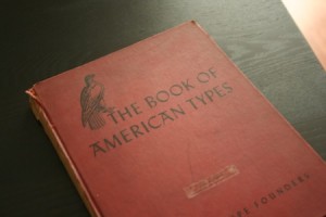
Last weekend I went to visit my mom, she lives an hour north of me in the town where I grew up. I had gone to community college starting back in 2003 and I always past this vintage shop, located in a building that used to be a barn. For years I drove by without ever stopping in, even though I had interest to. So this time when I went home for some reason I kept thinking about it — almost like it was calling me! So I decided to take a trip and FINALLY check it out after all this time.
I spent a good hour or so in there. Since I am a huge fan of collage and cutting things out I asked if they had any old books. I figured I could find something interesting and cheap enough to tear apart and use! But instead I came across a collection of old type books from the 1940s! I could not tell you how much the little kid in me wanted to jump up and down! I spoke to the man that works there he told me they belonged to a graphic designer named Murray Stein who lived and worked in New York City. Apparently he hoarded everything he owned and when he passed away his wife sold all of his work, books and supplies. I could not find any information on him but the man in the store told me he worked completely in the original style of graphic design – long before computers. And once technology started to take over the field, he decided to retire. The only thing that bugs me is the book has a sticker on it that says “Lou Kashins” and it is also written on the inside of the book too. Who knows, maybe Murray borrowed it and never gave it back to Lou. Either way, I am glad it ended up in my hands. I took some photos to share with you… this is only 1 of 3 books I came across. I will show the others in future posts.
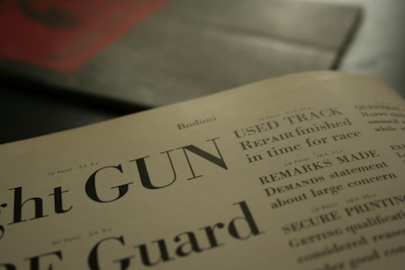
Bodoni
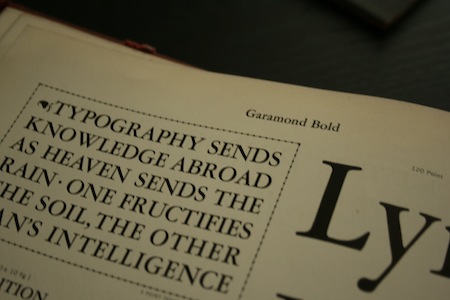
Garamond Bold
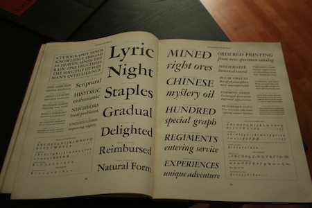
Facing pages – Garamond Bold and Garamond Bold Italic
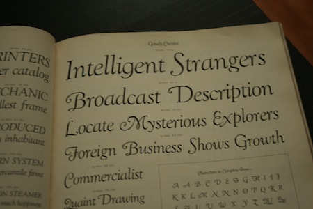
Goudy Cursive
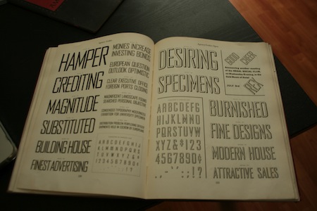
Agency Gothic Regular and Open
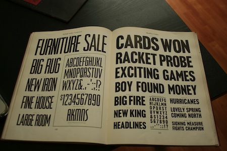
Raleigh Gothic Condensed and Headline Gothic
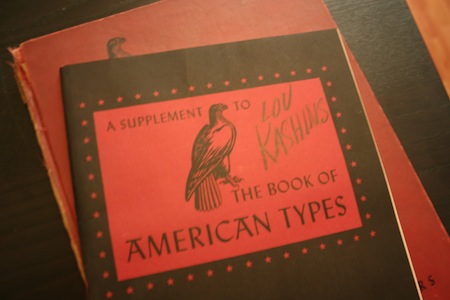
This book mainly focused on the examples of type sizes. 12pt, 36pt, 72pt etc..
I took photos of the inside of this book as well…
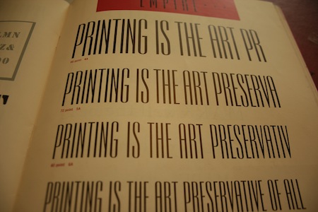
Empire Typeface
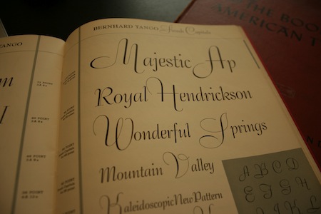
Bernhard Tango Swash Capitals
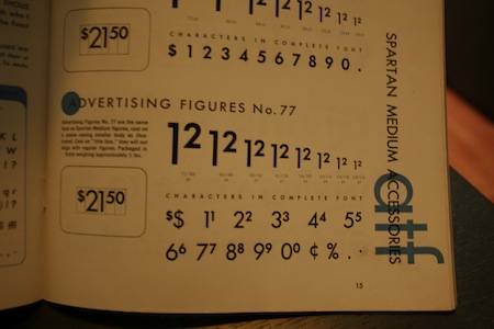
Advertising Figures – Examples of how money should be displayed
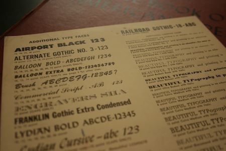
An even smaller chart a loose single page – found within the supplement book.





4 Comments
Great, really intersting.
I want it! LOL. Love the book, obviously. I plan on hitting up this really great book store in Detroit in two weeks, hopefully I can find something as cool!
Hi! I was just trolling the interwebs, doing a little bit of family research, and came across this entry. I can help you with this mystery – Lou Kashins is my late great uncle. Lou was a graduate of Cooper Union (also, I believe, a Graphic Design major), and became a very successful ad man in New York City. I’m sure he was probably a co-worker of Murray Stein’s, although I can’t remember what agency he worked for. He was a very funny guy, and my grandmother’s favorite brother; he used to come visit my family in New Jersey when I was a little kid in the Seventies, and my brother and I found him highly entertaining.
Anyway, that’s the story! Isn’t the internet a weird place?
Wow, I was searching for a typeface and came across the link to this post. I am a bit of a type design geek and I love books! I’ve been in the design and print industry for a while now and seeing beautiful type on paper has always fascinated me. Great post… That is awesome finding a little treasure like that. If you enjoy type design and the history be sure to check out a cool documentary, “Making Faces: Metal Type in the 21st Century”.
https://www.p22.com/merchandise-Making_Faces_DVD
Cheers,
🙂