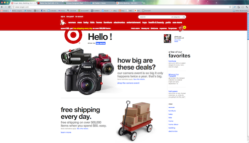

I really wish I had a screen shot of how it used to look… but from what I remember looking at items at Target.com was chaotic. Everything seemed to be a little congested on the site, now it seems wide open and clean. I love LOVE that they do not have “target” anywhere near the logo. That to me is a good change, who says we have to use words to know what it represents? I think its definitely a great idea and only so many logos can pull that off – at least in my opinion. Less Is More. This is one of those times. Although some may not agree – because the backend of it still needs work. As far as design is concerned – I love it! I think the 3D shopping cart is great too – made me smile. 🙂





No Comments