My boyfriend gave me the most beautiful card for valentine’s day this year! He also got me orchids… which I adore as well but this card was designed so beautifully. It reminds me of a tree I painted not too long ago…
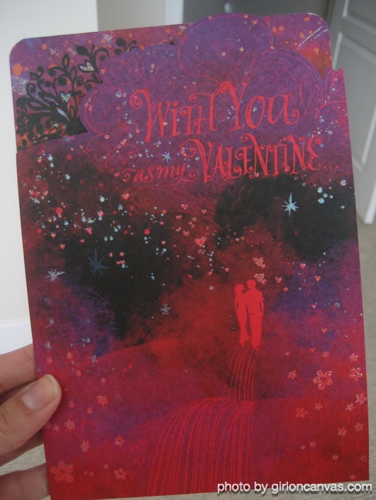
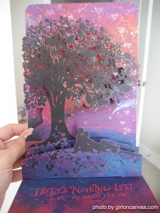
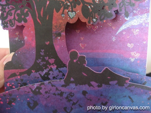
My boyfriend gave me the most beautiful card for valentine’s day this year! He also got me orchids… which I adore as well but this card was designed so beautifully. It reminds me of a tree I painted not too long ago…


I love the idea of this mat… it’s reversible! Design that can be seen either way boggles my mind a bit because I wouldn’t even know how to make it happen. But this made me laugh and I found it here.
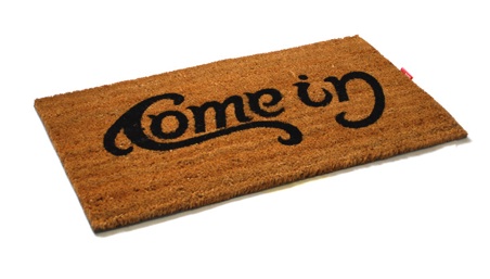
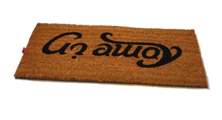
I had been wanting to make a new layout for a while, but I had a bad case of “creative block”… well not so much creative block more like “happy-with-what-I-made” block…. if there is such thing? I find it funny that I have no problem creating things for others but when it comes to making something for myself, and I am soo picky, and I get tired of staring at it so I start from scratch 400 times. I guess it is just good creative exercise in the end.
First I started out with this…

I wanted to show art and design in one but I felt it looked too… little kid-ish? So then I came up with this…
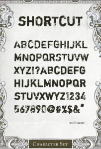
I used his free font named “Shortcut”:
Along with a few of his brushes as well and a vector from YSR1 I came up with this…

(also what you see above but this is without the pattern background)
Within the next week I will be adding content in the “goodies” section… so keep a look out for that!
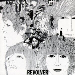
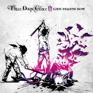
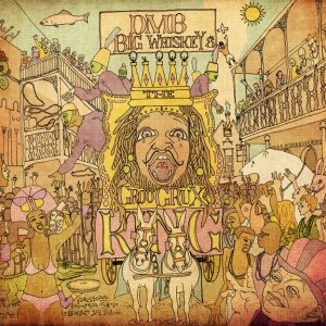
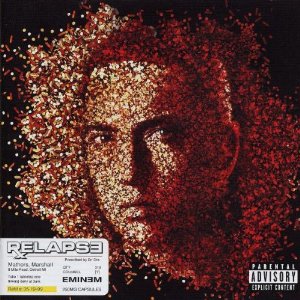
When I was younger CDs were my thing, long before ipods, or before I even knew what an mp3 was my discman went wherever I went. I knew from a young age I wanted my focus to be art – before I was even in high school. I used to think “I want to create CD covers for musicians”. I didn’t even know the word for that kind of art – which I now know as “graphic design” or “digital art”. Most mixed in with photography many musicians have had awesome album art and these are just some of my favorites. What’s your favorite album art?
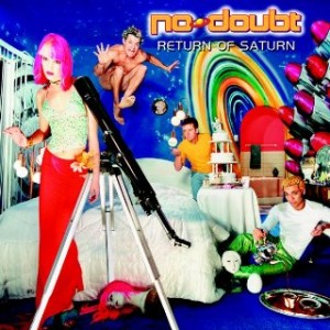
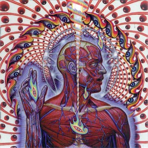
Three Days Grace – Life Starts Now
Dave Matthews Band – Big Whiskey and the Groo Grux King
Eminem – Relapse
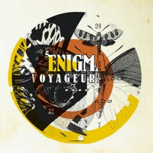
Enigma – Voyager
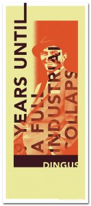
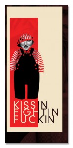
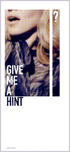
Sean Cahill our new artist of the week mixes art history, design and personality in his projects. I really enjoyed two of his projects: The Bar Cara Custom Art and the Google Picture project. His Bar Cara custom art kind of reminded me of a project I did not too long ago. I love mixing art history and design, I think it’s a great tribute. His Google picture project is very unique you’ll have to check out his site or read this entry to learn exactly how awesome it is 🙂
Sean Cahill on his projects:
Bar Cara, a recent client of ours, is a new Italian based restaurant in
Bloomfield, NJ who prides themselves on being a modern take on a traditional
taste. I decided to show this through the art on the walls. My goal was to
combine the traditional with the modern. I achieved this by juxtaposing
Modern imagery with traditional sculpture and historical landmarks. One of
my favorites is Rodin’s thinker sitting in front of a graffiti wall. I think
the imagery is particularly strong in this piece due to the duality of
street art. On one hand grafitti’s art, and on the other hand it’s
destructive. Considering both sides of the coin can lead to much though with
is expressed by The Thinker. I also snuck the Bar Cara logo into the
grafitti on the wall, it’s the black and yellow star.
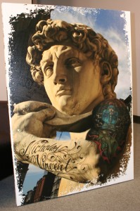
The Statue of David was also a fun piece to put together. Chef Ryan DePersio
is a really hip guy who fuels the energy of Bar Cara so I wanted to include
him in the art in some way. I actually took a photo Chef Ryan’s arm and
photoshopped his tattoo’s onto David’s arm. The background is photo of SoHo
New York. This pieces was very well received by Chef Ryan and also his son
Nicholas who’s name is tattooed on the arm.
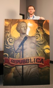
The Venus Di Milo made me laugh because I put her on stage as if she was the
lead singer of a band. Without arms it’s tough to look very active on stage!
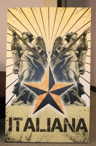
The pieces that read “italiana” was also based on music. I placed a bass
guitar in the angels hands. I though her natural position was asking for it.
The Angel with the tank is the most impactful for me. The imagery speaks for
itself and I think the Bar Cara logo (star) and sunrays compliment the whole
situation.
All the artwork was created in Photoshop at full size (roughly 3’x5′ each).
The documents ended up being huge files. It’s tedious working in
hi-resolution at such a large size because each move or change can take up
to 10 minutes to process, depending on detail. I worked with many blending
modes and of course a lot of masking. In the end the pieces turned out to
fit the motif of the restaurant very well.
The Google Picture Project was an exercise I created for myself to stay
sharp and keep my mind focused on art. In my line of work all the art I
produce is based on clients needs. I’m always designing within certain
requirements. Therefore I wanted to bring such “constraints” to my personal
expression. Thus the Google Picture Project was born. The concept behind the
Project is that I’ll create an Image, Picture or Poster using ONLY the
images Google provides based on a Image Searching a specific phrase. I don’t
get to choose the search phrases, instead they’re all suggested to me by
others. This method restricts the amount of images I can create with.
Sometimes I get a whole bunch of great images, sometimes nothing. It’s
interesting to see what searches turn up what images. More often than not, a
search that I think will be good ends up bad and the ones I think will turn
up nothing yeild the most.
One of my favorites was “Great White Beavers.” This was one of the strangest
phrases that was suggested to me. I ended up making the image much like a
screen print. I keep the colors solid and the amount of colors to a minimum.
I used about 3 separate images and combined them into one composition. This
is the same method I use for all the Google Picture Projects. I don’t know
of anyone doing design this way…using viewer input as jump off point. But
it’s proven very rewarding for me and the other participants. I often print
out the image and mail it to the people who suggested the phrase. Suggest
one and I’ll design it for you!
You can find out more about Sean Cahill at www.cahillstudio.com and www.radkidcool.com
Speaking of OnePageLove.com in my last entry, turns out my portfolio is in today’s entry on their site! I got their email when I woke up this morning, they let me know they added my page. What a great way to wake up on a Monday! I know I’ve been really really really slow with entries lately, but I’ve been busy with projects! And those projects pay me so they get a little bit more attention 😉
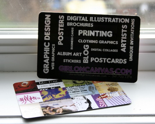
About a month ago I made my own postcard to pimp out this blog (just my cool way of saying advertise). They came out pretty nice, I had them printed at Overnightprints.com. They do print nice postcards with pretty UV coating and all BUT let me tell you, if you make a mistake and don’t align it right, they WON’T care, so make sure your preview of your project looks EXACTLY how you want it to! I’m going to give some of these away to whoever wants one I also had magnets made too. The magnet looks like the black side of the postcard with the words. I’m only going to give away 3 of the magnets, so if you want it email me fast! Send me your name/address and let me know if you want a postcard or both. [email protected].
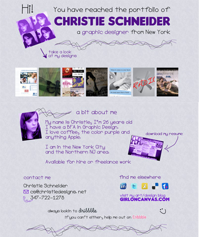
With lots of inspiration from OnePageLove.com I created my own one page portfolio. I used this Lightbox2 script. I tried a ton of different scripts and did not like any of them, I just keep going back to it. The only con that bothered me is that if used with another script, they interfere with each other and I’m not enough of a code dork to figure out why. But having more than one script wasn’t really necessary since I was trying to keep it simple anyhow. With some love of the color purple and a fun typeface I bring you this…
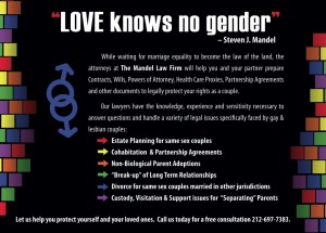
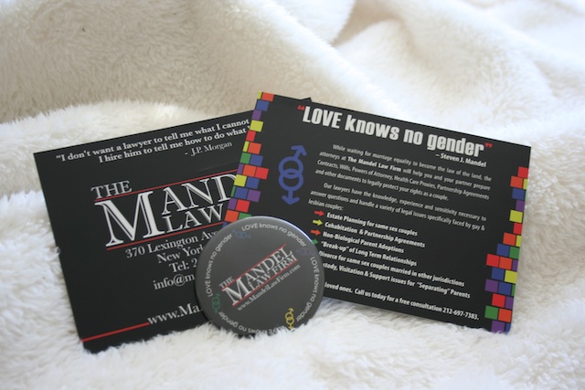
Recently I designed a postcard for a lawyer in NYC. He basically gave me text and left how it looked up to me. I was happy he let me have some creative freedom, some people tell you exactly what to put and I’m thinking “Well who is the artist here??”. I had a lot of fun working with him and even later meeting him. He wanted 4,000 of these made, and I order the prints too! Oh yes and I got to design them pins, which I had not done before. It was overall a great experience and here I share the digital and final product.
