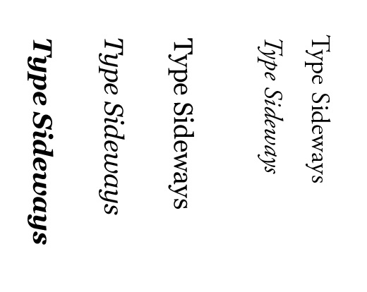
If you have ever been in the Northern Part of NJ visiting or living around the area you know about the Garden State Plaza. One of the biggest malls on the east coast one visit and it is a mall you won’t forget. I’ve only been going to this mall over the last three years and not too long ago they put up signs near some of the driving entrances. It was interesting when they first put it up – I wasn’t used to them being there. Something about it bugged me though. It felt almost as if the logo is upside-down. Should italic type be placed sideways – ever?! I don’t know – but the way this looks bothers me and I hope I am not the only designer that can agree.
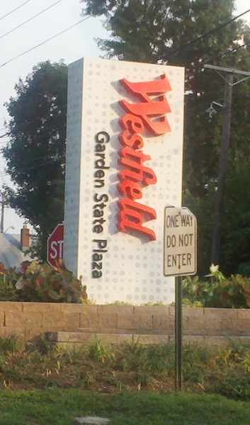
I wonder if it was a question whether or not they should place it that way – of course that is there logo so they couldn’t change it. Westfield is not just Garden State Plaza but a group of shopping centers. The only other option would be to put it horizontal and the sign would have to be a lot wider. But of course I am just ranting off the top of my head here — I have no idea about any of this. But it bugs me every time I see it at the mall, am I the only one who thinks italic type should not be placed sideways in such big form?
