Posted on March 5, 2011

Featured Artist… ???

Design

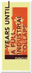
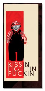
So each week I have been having “Artist of the week” but I have been thinking of changing it to “featured artist” since it is hard to get responses from people (on a timely basis) when I ask them if they’d like to be artist of the week. I’ve been so busy lately, so I haven’t had time to look for artists I’d like to feature. Not to mention all the artists have been guys… I would LOVE to feature some lady artists! So if you’re interested leave a comment and let me know. I’m working on a lot of other content for the site as well, so once I get that up I’m going to include a page where anyone can submit a message if they would be interested in being a “Featured Artist”. But for now, comments will do.

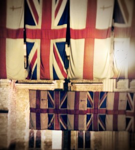
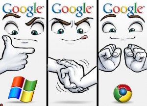
I’m working on a few projects right now… a logo being one. When I was searching for some inspiration, I came across this photo and it made me laugh so I thought I would share. I got it off softpedia.com and the image credit is Federico Fieni.
Posted on February 27, 2011

Artist of the Week – George Missi

Art

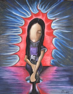
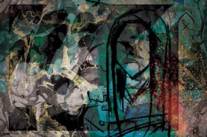
Al Fatat (the girl)

Al Fatat (the girl)


I’m George Missi, 24 years old, I’m from Latakia-Syria, I’m studying graphic design in University of Kalamoon, and I’ll graduate this year. I like to work on Video Art, Digital drawings &photography. I’m thinking of working in the Multimedia field & miscellaneous designs after I graduate. I’ve participated in 5 exhibitions that took place at my University. Also I’ve participated in an exhibition in Damascus, Syria its called “New Art Exhibition” &I Presented a video art called “The History That Shouldn’t be”

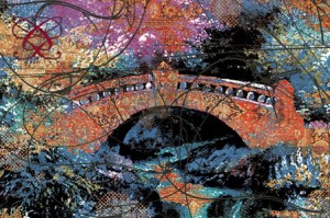
Torath(culture)

Torath(culture)


My latest project it’s called “Subtitle” it was presented online on my website between (FEB 17,2011-FEB 19,2011) & the project contains 6 digital work drawings, these paintings are translated into components and events we face in our daily life. Each one of these paintings contains different objects like (lines, photos & drawings) mixed together to create a painting. I gave the paintings Arabic names like (Torath means Culture, Al Fatat means the girl, Al Moot means the death, Raqes means dancing, El Denya means The World, Al Qateel means The Killing).


Dancing

Dancing


You can view all my projects on my website www.GeorgeMissi.com and contact me on Facebook page facebook & twitter – @gmissi.

I would like to thank Christie for giving me this great opportunity to be on her beautiful blog.

Posted on February 20, 2011

Artist of the Week – Quinn Michaels

Art

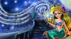
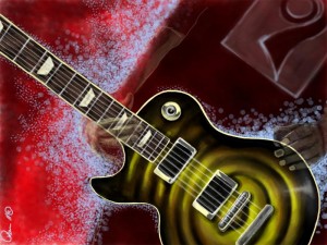
Quinn Michaels does a lot of old fashion and digital drawing and painting. And our newest digital medium – iPad art. He has a mixture of cartoon-ish drawings to abstract paintings. From Shrek to Donald Duck, he even has Lady Gaga – called “Gagaverse” and I had to laugh. If Gaga could, she WOULD have her own universe (and I sometimes think she thinks she is already there). My favorite was the digital painting “Starry Night Mermaid” which collaborates Vincent Van Gogh and The Little Mermaid… which just so happen to be MY favorite artist and movie mixed together. Also take a look at his video of his guitar drawing – it will have you mesmerized! Find more of his work at www.thequinnshow.com


Posted on February 13, 2011

Artist of the Week – Matt Keeling

Art

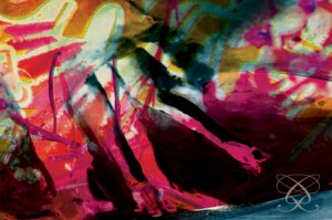
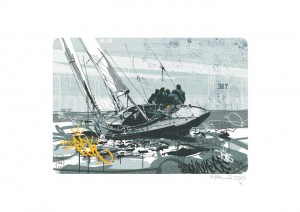
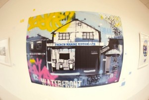
Matt Keeling has been working as a graphic designer and illustrator for the past 9 years. He has his own unique style which I think of as chaos and order all in one. This one particular series he had done a mixture of a subject with a graffiti feel to it. I love it! To me the more chaotic or distressed looking, the more interesting it is =] If you’d like to see more or even order prints please visit http://www.thepapershedgallery.co.uk/. You can also find out more about Matt at his personal site/portfolio http://www.mattkeeling.com/


The artist on his work:

Having been influenced through my work in the fashion industry and freelance work as an illustrator over the last 12 years, this work takes inspiration mainly from street artists such as Shepard Fairey, Eelus, Dface, Eine, Kevin Cyr and Mysterious Al to name a few. Having also painted watercolour landscapes for many years the work is a combination of the street inspired work that forms my freelance projects and my interest in local landscapes. I have tried to re-interpret the traditional landscape you may hang on the wall at home as a modern and urban piece of art. All the works are hand drawn with marker pens and then scanned into my Mac. I then use Photoshop and a Cintiq tablet as my tools of choice to paint/attack and work into the image. I like to bring type and hits of colour into an otherwise monochrome view, the colour to give the image punch and depth and the type to bring the graphic and bold feel that I love.

Posted on February 11, 2011

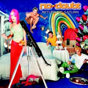
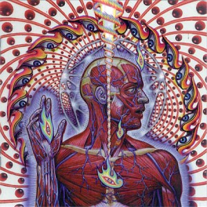
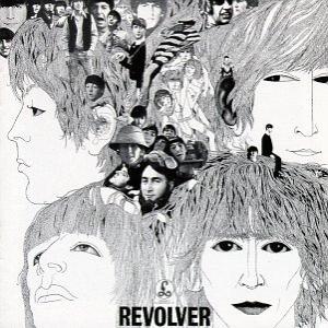
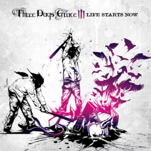
Some favorite album art

Design

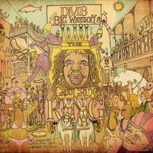
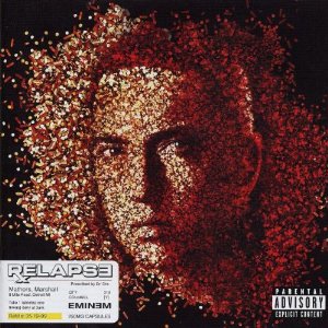
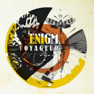
When I was younger CDs were my thing, long before ipods, or before I even knew what an mp3 was my discman went wherever I went. I knew from a young age I wanted my focus to be art – before I was even in high school. I used to think “I want to create CD covers for musicians”. I didn’t even know the word for that kind of art – which I now know as “graphic design” or “digital art”. Most mixed in with photography many musicians have had awesome album art and these are just some of my favorites. What’s your favorite album art?


No Doubt – Return of Saturn


Tool – Laterlus


The Beatles


Three Days Grace – Life Starts Now

Dave Matthews Band – Big Whiskey and the Groo Grux King

Eminem – Relapse

Enigma – Voyager

Posted on February 6, 2011

Artist of the Week – Richard Gallon

Art

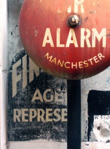
From London our artist of the week Richard Gallon, like myself has many interests. Photography, crafts, and design. I think for any true artist you can’t just limit yourself to just one focus, in my opinion it would make me crazy! But Richard has a love for all of them, and my favorite from his work is his photography. Although he has tons of photos on flickr, I chose my favorites from his top 25. Each photo links to the flickr page for that photo. My favorite is fire alarm. Anything weathered, aged with an old grungey look makes my eyes light up! Especially when it has text 😉 I truly think he nailed the composition beautifully as well.


Richard on his work:

When I decided to study to become a graphic artist, I took a course that allowed me to learn about both graphic design and fine art. This interest has continued throughout my work every since, and I think my most successful pieces balance these two approaches well.

The other two influences on my work are music (I am obsessed cassette tapes) and photography. I think it is the immediacy of these media is what particularly appeals, and these threads run throughout my work, too.

This year, the plan is to focus on editioned work. I am setting up an art ‘label’ (@personalsounds) to release one artwork a month, in editions of 25. Releases will include graphic works, DVDs and music, with the first release – Alta Punt Abrir, (http://www.etsy.com/listing/59598141/alta-punt-abrir-ltd-edition-of-25) being a combination of all three.

Apart from that, I am based in London, love to cook, and am currently working through the boxsets of Twilight Zone and Starsky & Hutch.


Could you be “Artist of the Week”? Email me CS @ girloncanvas.com (no spaces) with a link to your portfolio or just send photos!

Posted on January 30, 2011

Artist of the Week – Sean Cahill

Art


Sean Cahill our new artist of the week mixes art history, design and personality in his projects. I really enjoyed two of his projects: The Bar Cara Custom Art and the Google Picture project. His Bar Cara custom art kind of reminded me of a project I did not too long ago. I love mixing art history and design, I think it’s a great tribute. His Google picture project is very unique you’ll have to check out his site or read this entry to learn exactly how awesome it is 🙂

Sean Cahill on his projects:

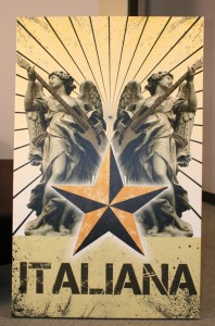
Bar Cara, a recent client of ours, is a new Italian based restaurant in
Bloomfield, NJ who prides themselves on being a modern take on a traditional
taste. I decided to show this through the art on the walls. My goal was to
combine the traditional with the modern. I achieved this by juxtaposing
Modern imagery with traditional sculpture and historical landmarks. One of
my favorites is Rodin’s thinker sitting in front of a graffiti wall. I think
the imagery is particularly strong in this piece due to the duality of
street art. On one hand grafitti’s art, and on the other hand it’s
destructive. Considering both sides of the coin can lead to much though with
is expressed by The Thinker. I also snuck the Bar Cara logo into the
grafitti on the wall, it’s the black and yellow star.

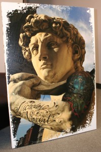
The Statue of David was also a fun piece to put together. Chef Ryan DePersio
is a really hip guy who fuels the energy of Bar Cara so I wanted to include
him in the art in some way. I actually took a photo Chef Ryan’s arm and
photoshopped his tattoo’s onto David’s arm. The background is photo of SoHo
New York. This pieces was very well received by Chef Ryan and also his son
Nicholas who’s name is tattooed on the arm.

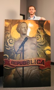
The Venus Di Milo made me laugh because I put her on stage as if she was the
lead singer of a band. Without arms it’s tough to look very active on stage!
The pieces that read “italiana” was also based on music. I placed a bass
guitar in the angels hands. I though her natural position was asking for it.
The Angel with the tank is the most impactful for me. The imagery speaks for
itself and I think the Bar Cara logo (star) and sunrays compliment the whole
situation.

All the artwork was created in Photoshop at full size (roughly 3’x5′ each).
The documents ended up being huge files. It’s tedious working in
hi-resolution at such a large size because each move or change can take up
to 10 minutes to process, depending on detail. I worked with many blending
modes and of course a lot of masking. In the end the pieces turned out to
fit the motif of the restaurant very well.

The Google Picture Project was an exercise I created for myself to stay
sharp and keep my mind focused on art. In my line of work all the art I
produce is based on clients needs. I’m always designing within certain
requirements. Therefore I wanted to bring such “constraints” to my personal
expression. Thus the Google Picture Project was born. The concept behind the
Project is that I’ll create an Image, Picture or Poster using ONLY the
images Google provides based on a Image Searching a specific phrase. I don’t
get to choose the search phrases, instead they’re all suggested to me by
others. This method restricts the amount of images I can create with.
Sometimes I get a whole bunch of great images, sometimes nothing. It’s
interesting to see what searches turn up what images. More often than not, a
search that I think will be good ends up bad and the ones I think will turn
up nothing yeild the most.

One of my favorites was “Great White Beavers.” This was one of the strangest
phrases that was suggested to me. I ended up making the image much like a
screen print. I keep the colors solid and the amount of colors to a minimum.
I used about 3 separate images and combined them into one composition. This
is the same method I use for all the Google Picture Projects. I don’t know
of anyone doing design this way…using viewer input as jump off point. But
it’s proven very rewarding for me and the other participants. I often print
out the image and mail it to the people who suggested the phrase. Suggest
one and I’ll design it for you!

You can find out more about Sean Cahill at www.cahillstudio.com and www.radkidcool.com

Posted on January 26, 2011

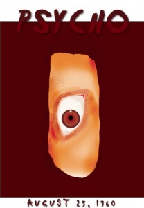
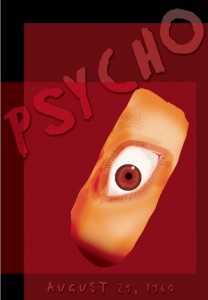
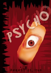
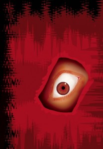
Evolution of my Psycho poster

Design

A week or so ago I was looking through my BFA folder from college. Of course I’ve discussed them many times in the past – my horror movie posters. This time when I looked at my Psycho poster I realized I saved it each time I made drastic changes. So I wanted to share the “Evolution of my Psycho Poster”. I had started it in Photoshop and then brought it into illustrator to add text and grunge effects. I had drawn the eye in photoshop using my wacom tablet. It took me quite a long time to get to the final one. Hours and hours of work, only because at the time I was not set on a “style”. While making this specific poster it hit me to do them all in a grunge/stressed style. I wanted to do them all a similar way I just could not find how to make them look like a series. Took me 2-3 months to figured it out. It was a really stressful experience but once I figured out my style, every poster I designed after that it wasn’t as hard or time consuming. I was able to focus more on actually creating than wondering what style it would be. It ended up working out really well, because all my professors were very pleased. Especially since I had thought of this thesis so last minute. All my posters were 27 x 39inches, thankfully I have a MBP so it only took a minute or two to save these big files! I don’t think windows+photoshop could handle it ;]. Here is the progress of my poster – originally created last February 2010.


Back to top