Browsing Tag

blog

Posted on January 30, 2011

Artist of the Week – Sean Cahill

Art


Sean Cahill our new artist of the week mixes art history, design and personality in his projects. I really enjoyed two of his projects: The Bar Cara Custom Art and the Google Picture project. His Bar Cara custom art kind of reminded me of a project I did not too long ago. I love mixing art history and design, I think it’s a great tribute. His Google picture project is very unique you’ll have to check out his site or read this entry to learn exactly how awesome it is 🙂
Sean Cahill on his projects:

Bar Cara, a recent client of ours, is a new Italian based restaurant in
Bloomfield, NJ who prides themselves on being a modern take on a traditional
taste. I decided to show this through the art on the walls. My goal was to
combine the traditional with the modern. I achieved this by juxtaposing
Modern imagery with traditional sculpture and historical landmarks. One of
my favorites is Rodin’s thinker sitting in front of a graffiti wall. I think
the imagery is particularly strong in this piece due to the duality of
street art. On one hand grafitti’s art, and on the other hand it’s
destructive. Considering both sides of the coin can lead to much though with
is expressed by The Thinker. I also snuck the Bar Cara logo into the
grafitti on the wall, it’s the black and yellow star.

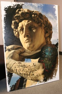
The Statue of David was also a fun piece to put together. Chef Ryan DePersio
is a really hip guy who fuels the energy of Bar Cara so I wanted to include
him in the art in some way. I actually took a photo Chef Ryan’s arm and
photoshopped his tattoo’s onto David’s arm. The background is photo of SoHo
New York. This pieces was very well received by Chef Ryan and also his son
Nicholas who’s name is tattooed on the arm.

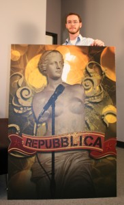
The Venus Di Milo made me laugh because I put her on stage as if she was the
lead singer of a band. Without arms it’s tough to look very active on stage!
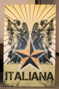
The pieces that read “italiana” was also based on music. I placed a bass
guitar in the angels hands. I though her natural position was asking for it.
The Angel with the tank is the most impactful for me. The imagery speaks for
itself and I think the Bar Cara logo (star) and sunrays compliment the whole
situation.

All the artwork was created in Photoshop at full size (roughly 3’x5′ each).
The documents ended up being huge files. It’s tedious working in
hi-resolution at such a large size because each move or change can take up
to 10 minutes to process, depending on detail. I worked with many blending
modes and of course a lot of masking. In the end the pieces turned out to
fit the motif of the restaurant very well.
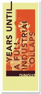
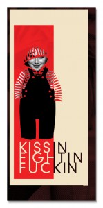
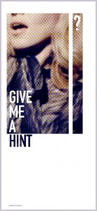
The Google Picture Project was an exercise I created for myself to stay
sharp and keep my mind focused on art. In my line of work all the art I
produce is based on clients needs. I’m always designing within certain
requirements. Therefore I wanted to bring such “constraints” to my personal
expression. Thus the Google Picture Project was born. The concept behind the
Project is that I’ll create an Image, Picture or Poster using ONLY the
images Google provides based on a Image Searching a specific phrase. I don’t
get to choose the search phrases, instead they’re all suggested to me by
others. This method restricts the amount of images I can create with.
Sometimes I get a whole bunch of great images, sometimes nothing. It’s
interesting to see what searches turn up what images. More often than not, a
search that I think will be good ends up bad and the ones I think will turn
up nothing yeild the most.

One of my favorites was “Great White Beavers.” This was one of the strangest
phrases that was suggested to me. I ended up making the image much like a
screen print. I keep the colors solid and the amount of colors to a minimum.
I used about 3 separate images and combined them into one composition. This
is the same method I use for all the Google Picture Projects. I don’t know
of anyone doing design this way…using viewer input as jump off point. But
it’s proven very rewarding for me and the other participants. I often print
out the image and mail it to the people who suggested the phrase. Suggest
one and I’ll design it for you!

You can find out more about Sean Cahill at www.cahillstudio.com and www.radkidcool.com
Posted on January 23, 2011

Artist of the week – Sam Abdallah

Art

Now for another artist of the week from New Jersey! My jaw dropped to the floor when I saw this series of photos he had done. I love crazy ideas like this one! I hope you enjoy it as much as I did. This series is titled “Some Assembly Required” by Sam Abdallah. It is a project he has been working on for 3 years. Visit SamAbdallah.com to see more from this collection. Now for a little bit of information from Mr. Abdallah himself:

The Idea came about because I used to work with a photographer who treated their models really poorly, he would constantly go up to them and grab them and say thing like “this one needs new arms they are too lanky” or “this one needs a prettier face”. He would treat them like object and the models would LET him do it, to the point where it looked like they were losing their personalities.

So i thought to myself “how could I show the way this guy is treating his models in such a way where its interesting and different” , I then remembered how back in college I did a project in which I had to represent one of the 7 deadly sins which was “vanity” and I did a photo in which the woman in it had removed her head to apply makeup and thought that it would be a perfect way to represent what I was going for.

So now by showing the models with their heads/parts detached from the rest of them it shows how their parts are nothing more than clothing accessories that they could just change to suit their feelings. It also has some more hidden meanings behind it, showing how vain our society has become.


I wanted the photos to be in such a way where its comical but eye popping so that it captures the viewers attention and keeps them looking. I am almost done with the series, I have 75 different photos with various models so far, but am looking to get to about 100-150 photos with different models

More about the artist:
Sameh Abdalalh is a Graphic Designer/Photographer. He has been a designer for about 5 years professionally and a Photographer for about 7 years professionally. He graduated from William Paterson University with a BFA and a concentration in computer graphics. He worked for about 3 years as a product designer/ graphic designer for two companies, Springfield Precision Instruments and Taylor Precision Products/HoMedics. Currently he is searching for employment while working on his projects and photography in his spare time. Visit SamAbdallah.com to see more of his work.

Posted on January 16, 2011

Artist of the week – Paul Jach

Art


Paul Jach has been working as a freelance artist since receiving his BFA majoring in Illustration from the Academy of Art University in San Francisco, CA in 1998. He has participated in several solo and group shows, as well as commercial work for created event posters for Bill Graham Present’s Fillmore West and Warfield Auditorium, Carnegie Hall’s Weill Auditorium and the record label Saturday Morning Records. In 2001, Paul formed the art collective, Speak-Easy Art. In January of 2009, Paul partnered in Speak-Easy Art Gallery with fellow artist, Michael Paquette. Speak-Easy Art Gallery sets a new standard in showcasing established and emerging artists. They have created a space, both interesting and accessible to all art enthusiasts. As co-owner of the gallery, Paul serves as co-curator and education director. www.SpeakEasyArt.com

Paul on his Work:

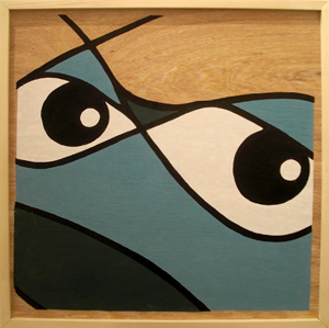
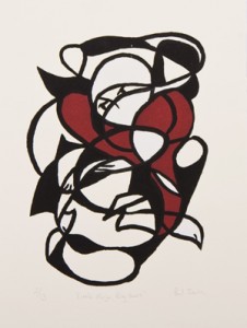
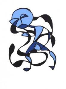
To create the doodle series, I used a subconscious constructive technique and knew that I wanted it to begin with line. For most of us, our first experience in creating art is to scribble on a piece of paper. This is a primal impulse for us, we naturally make these marks once a drawing implement is put in our hand. I felt the place where we all begin in art, an experience that most of us share, would be an interesting place to start with these prints. That line would then ultimately become the skeleton of the pieces. I wanted the curves of the lines to be more controlled than just scribbling, yet remain free flowing. The nature of the lines in some ways also references the graffiti tags that had caught my eye while riding the city buses in the past. To make the work more unique, I explored printing on surfaces other than paper, such as sheet metal, wood and backlit plexiglass. www.PaulJach.com

Back to top