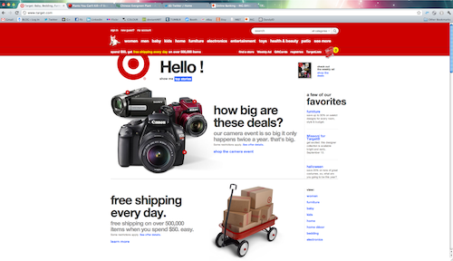

I really wish I had a screen shot of how it used to look… but from what I remember looking at items at Target.com was chaotic. Everything seemed to be a little congested on the site, now it seems wide open and clean. I love LOVE that they do not have “target” anywhere near the logo. That to me is a good change, who says we have to use words to know what it represents? I think its definitely a great idea and only so many logos can pull that off – at least in my opinion. Less Is More. This is one of those times. Although some may not agree – because the backend of it still needs work. As far as design is concerned – I love it! I think the 3D shopping cart is great too – made me smile. 🙂

There is a new tool out by Wacom – WOW do I wish I had this in college! I have a tendency to draw things, take pictures with my cell phone and then trace it in illustrator. (Yes I am too lazy to even get up and scan them) This saves a lot of steps. I would really love to try it out and see how well it works. If you have any experience with this let me know. I would love to see it in action and possibly share it here. They will be available mid-september so keep checking the Wacom site for more updates.
Jayson Lilley has some really amazing paintings with bright colors and high-contrast. I think that is what made me love his work so much was the contrast – the cow is definitely my favorite but his landmark paintings are great too. He is over in London but when he has a show in New York I will be first in line! Take a look at his website or follow him on twitter – @iamjaysonlilley.


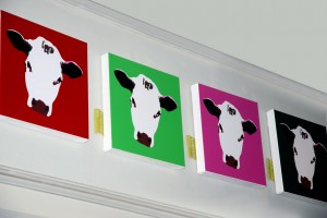

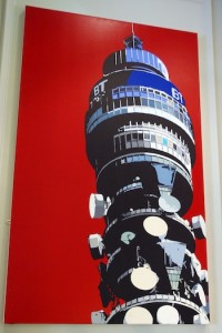
From iconic London landmarks like Battersea Power Station, the Trellick Tower and South Bank to everyday subject matters like mopeds, buses and English breakfasts – Jayson Lilley’s art makes the ordinary look extraordinary.
With his signature bold colours, limited palette and illustrative approach, Lilley’s graphic novel style certainly packs a punch.
Taken from his website: www.jaysonlilley.co.uk/
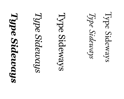
If you have ever been in the Northern Part of NJ visiting or living around the area you know about the Garden State Plaza. One of the biggest malls on the east coast one visit and it is a mall you won’t forget. I’ve only been going to this mall over the last three years and not too long ago they put up signs near some of the driving entrances. It was interesting when they first put it up – I wasn’t used to them being there. Something about it bugged me though. It felt almost as if the logo is upside-down. Should italic type be placed sideways – ever?! I don’t know – but the way this looks bothers me and I hope I am not the only designer that can agree.
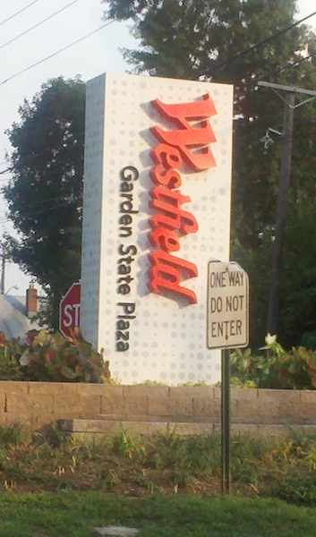
I wonder if it was a question whether or not they should place it that way – of course that is there logo so they couldn’t change it. Westfield is not just Garden State Plaza but a group of shopping centers. The only other option would be to put it horizontal and the sign would have to be a lot wider. But of course I am just ranting off the top of my head here — I have no idea about any of this. But it bugs me every time I see it at the mall, am I the only one who thinks italic type should not be placed sideways in such big form?
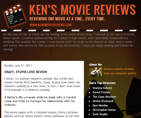
Creativity I believe has been handed down to my brother and I through our genes! Well really, that is just my belief. After many years of trying to convince him to write – I helped my brother create his own movie review blog. He is very passionate about movies, and can explain things to you about the acting, the cast, the director etc… things I never thought about with movies! I just saw the movie Black Swan and I needed an explanation – my brother was the first person I called. He is very talented and notices details only a certain mind or eye could catch. He writes very well too and I think combining both of what he does well into his own outlet is a great idea. I can 100% see him being one of those insane genius directors for movies one day. Of course with any kind of art you need to put yourself out there and make yourself be known! This blog is his start – and I wanted to share it here. Follow his blog and get a special treat from yours truly 🙂 Just let me know if you do…
Ken’s Movie Reviews
I came across this fun animated video by Epipheo Studios. At the end I was waiting for them to say “You may not choose Google, but Google will choose you”. I remember back in 2004 when I was waiting for my gmail invite. Of course now I have my google+ and I plan to make a nice private home here. I hope Google+ sticks around and even if Facebook is still the king of social networks, at least those who do not like it have an alternative. Facebook has now become the new myspace – I don’t even want to go on it anymore. Too much drama and I don’t care if you are feeding your llama or eating potato chips in your bathroom. I would rather spend my time being creative… or blogging! 🙂
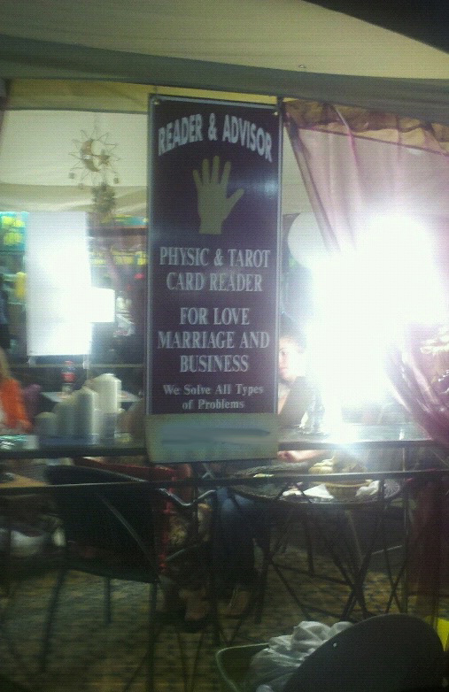
How does this happen? You design a sign for a client and neither you nor the client realize a word is spelled wrong. Ok so maybe anyone can mix up “Physic” and “Psychic” but still, someone should have noticed this along the line. It is a fairly simple sign – not much writing to have to use ‘spell check’. I saw this at the state fair — and there wasn’t just 1 sign there were 4. FOUR SIGNS. How could neither the designer or client notice this? Boggles my mind.
